

Went full vibe-coder mode and ended up building a virtual memorial with beautiful photo animations
- Alejandro Gaio
- Dec 7, 2025
- 9 min read

Updated: Dec 8, 2025
My initial thoughts on vibe coding
First, a quick note for anyone who’s heard the term “vibe coding” but isn’t exactly sure what it means.
The term was coined by Andrej Karpathy, former researcher and OpenAI co-founder, to describe a new way of creating software with AI acting as your coding partner.
Instead of writing every line yourself, you just tell the AI what you want. For example, instead of typing HTML, tweaking TypeScript functions, and juggling CSS, you might say: “Put a textbox in the upper-right corner, style it to match the project, and call UpdateNickName on text change.” Then you let the AI handle the rest. Basically, you “forget about coding.”
The first time I heard about "vibe coding" was in a YouTube video by Fireship. My reaction was: “What the hell is this? So now anyone with zero software background can build working apps?”
I was skeptical and started to think it was BS.
But a few weeks later, the "vibe coding" mantra was everywhere—and it was real.
People with no technical background were publishing websites and shipping apps faster than I can boil an egg.
So I decided to try it myself. Why not? If I can make crappy apps with a code editor, I can surely make even crappier ones with the help of an AI agent—and really feel the vibe.
Vibe coding put into practice
My goal was to build something from scratch using a framework I’d never touched before. That way I could learn along the way and put the whole vibe coding concept to the test.
For the setup, I used Cursor to provide the “vibe,” and chose Next.js just because it’s the trendy choice for frontend work.
I’ve used React a bit, but I had zero Next.js experience. It's also worth noting that these code-aligned AI models perform better with mainstream frameworks and languages than with more obscure options—sorry, Turbo Pascal.
The project idea was simple: a small SaaS where people can upload photos of loved ones who are no longer with us, placing them in a virtual space meant to last forever. Some of those photos could be animated with AI to bring moments back to life. Nothing fancy like Facebook or Instagram—just a straightforward virtual memorial service with a twist.
For instance, this is an old photo of my grandpa:


And this is a photo animation generated by the app:


The good and the bad of “the vibe”
Vibe coding isn’t a magic wand that conjures beautiful apps out of thin air. It has real strengths and real limitations. Here’s what I found.
Pros
⏱️ Huge time savings. This was a game changer. It’s incredible how much boilerplate and repetitive work an AI can handle with a single prompt. Hours disappear into minutes.
🧹 Good practices out of the box. With popular frameworks like Next.js, LLMs often apply modern conventions and clean architecture from the start. It’s like pairing with a developer who actually reads documentation.
🔌 Smart package integrations. For example, I needed user authentication with Google login; the AI set up Clerk—something I didn’t even know existed. I needed a backend database; it configured Supabase. For the UI, it automatically set up shadcn and generated a matching color palette with minimal direction from me.
🩺 Error detection and auto-fixing. The model does make mistakes, but many get caught during build time. After each change it usually asks permission to run a build, and when something breaks, it jumps straight to the error and attempts a fix. This part feels like magic.
🐛 Runtime error help. When the app does launch and errors appear—missing .env values, permission issues with Clerk JWTs, broken DB access—you can usually just paste the error into the chat and the AI will either fix it or tell you exactly what to do.
🎨 Effortless global changes. Forgot a color in the palette? Need to update all buttons from bg-primary to bg-secondary in app/dashboard? Just say it, and a few seconds later, done.
📚 A powerful learning tool. For someone learning a new framework, it’s gold. I learned more by studying the generated code than I ever would by watching a dozen YouTube tutorials.
There are no pros without cons... or so they say.
Cons
🎯 You need to know what you want. This isn’t a standalone “make me something nice” magic box. You need to find the balance between being specific enough and not overwhelming the model. Bad prompts can waste time and money. Developers generally have an easier time prompting because they already know how things should work under the hood.
🤖 Model matters. I started with Claude Sonnet 4.5. Good model, but after long tasks it sometimes got stuck in fail–fix–fail cycles that burned through tokens. When I switched to GPT-5 for this project, it understood structure and planning far better. Not a universal recommendation—just what worked for me.
🧪 You can get lazy. This depends on discipline. It’s easy to trust the AI too much and skip reviewing the output. That’s how runtime bugs, security issues, and weird architectural choices slip in. My advice: always review the generated code. It’s still code you didn’t write.
How to use it effectively
Here are a couple of tips that could help vibe coding flow smoothly.
Use a copilot
For the initial prompt that would eventually shape my entire app, I turned to Claude.
I didn’t ask it to build the app itself; I asked it to craft a Cursor prompt capable of defining the app within that environment. The output was impressively detailed—thanks in large part to the guidelines I provided upfront.
You can pair up with ChatGPT or Claude like I did, or just stick to Cursor and alternate between “Agent mode” and “Ask mode.” Agent mode will make actual code changes, while Ask mode keeps things read-only—basically letting you chat with Cursor the same way you would with ChatGPT or Claude, without ever leaving VS Code.
Keep prompts short and on target
If you can’t keep a prompt short, at least make sure it targets a single task or outcome. It sounds obvious, but at the start of a project it’s easy to dump a bunch of requests into one prompt—and that usually leads to confusion or unwanted results.
It’s fine if your first prompt is relatively long—especially if it establishes coding guidelines, colors, styles, and other foundational decisions. Just avoid mixing those elements with instructions on authentication, database setup, or the full site structure. Keep each request separate.
Start a new chat whenever you begin a new feature
Opening a fresh chat for every feature keeps the AI’s context window small, making it easier to iterate, fix issues, and introduce changes at a low cost. There are cases where continuing in the same chat makes sense, but only when the feature shares a meaningful high-level context that benefits the AI’s understanding.
If the AI fails a few times, try switching models
If the AI can’t deliver what you need after two or three attempts, it might be time to change models. That’s what happened to me when I moved from Sonnet 4.5 to GPT-5—I immediately saw fewer errors and far fewer fail–fix–retry cycles.
Examples of some of the prompts I used for the memorial
I used a lot of prompts to build this site, and it makes no sense to put them all here, but I'll share what I consider the most relevant ones:
The initial prompt
Create a Next.js application for a memorial service that allows users to create beautiful, personalized memorial pages for their loved ones (people or pets) who have passed away. Use the latest versions of any component needed. Create the landing page with these sections: hero with a CTA, features section, a section with image-to-video previews, a pricing section with 3 prices: free, standard ($4.99) and premium ($7.99) and a footer.
Claude returned a very detailed prompt for Cursor, which I only minimally edited in order to add some info, for example pricing numbers, and adjusted the color palette. The rest came from the LLM model:
# Next.js Memorial Page Application - Development Instructions
Create a Next.js application for a memorial service that allows users to create beautiful, personalized memorial pages for their loved ones (people or pets) who have passed away.
## Tech Stack & Configuration
### Core Dependencies
- Next.js: Use the latest version with App Router
- Tailwind CSS: Latest version
- shadcn/ui: Latest version for UI components
- Clerk: For user authentication
- Supabase: For database (user info) and file storage (images)
### Tailwind Color Palette Configuration
Configure Tailwind with the following custom color palette:
- Primary: `#865DFF`
- Accent: `#E384FF`
- Neutral: `#191825`
- Secondary: `#FFA3FD`
## Application Structure
### Authentication Requirements
- Main landing page is publicly accessible (no authentication required)
- Top navigation bar with:
- If authenticated: Display user name and avatar in top-right corner
- If not authenticated: Display "Sign Up" button in top-right corner
### Main Landing Page Sections
#### 1. Hero Section
- Title: "Love remembered, love eternal."
- Subtitle: "A timeless space to honor the lives that touched our hearts"
- Design with emotional impact and elegant typography
#### 2. Features Section
Showcase three main features:
1. Upload pictures of your loved ones
2. Add a memorable quote or short story
3. Share a communal space where friends and family can leave messages
Create visually appealing feature cards with appropriate icons.
#### 3. Pricing Section
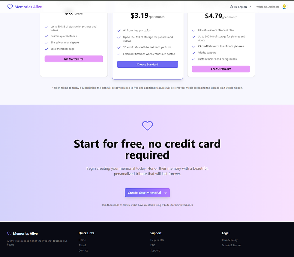
Create three pricing cards with proper icons and clear hierarchy:
Card 1: Free
- 3 pictures with custom quote/story
- Shared communal space
Card 2: Standard Plan
- Description: "Basic features, at $4.99 per month, paid yearly"
- Features:
- All from free plan, plus:
- Up to 10 pictures + 1 short video, with custom quotes/stories
- 3 credits to animate pictures (*)
- 1 short video
- Email notifications when entries are posted into the communal space
Card 3: Premium Plan
- Description: "All features, at $7.99 per month, paid yearly"
- All features from Standard plan with emphasis on "All features"
#### 4. CTA (Call to Action) Section
- Text: "Start for free, no credit card required"
- Button: Links to sign-up page
- Make this section prominent and conversion-focused
#### 5. Footer Section
- Copyright notice
- Links to:
- Privacy Policy page
- Terms of Service page
## User Flow
- Both the CTA section button and the "Sign Up" button in the top bar should navigate users to the Clerk sign-up page
- Ensure smooth authentication flow integration with Clerk
## Design Guidelines
- Use the custom color palette throughout the application
- Create an emotional, respectful, and beautiful design befitting a memorial service
- Ensure responsive design for all screen sizes
- Use shadcn/ui components for consistency and polish
- Implement smooth transitions and animations where appropriate
## Database Schema (Supabase)
Set up necessary tables for:
- User profiles
- Memorial pages
- Uploaded images (file storage)
- Communal space messages/entries
## Additional Notes
- Prioritize elegant, respectful design that honors the sensitive nature of the service
- Ensure optimal image handling and display
- Implement proper error handling and loading states
- Follow Next.js best practices for performance optimization
Prompt for adding upload functionality
Add file upload capability to the dashboard page, in the section "Create New Memorial". When a file is uploaded, a POST to the /api/upload endpoint should be sent with the file contents. Check that the selected file is of type jpg, jpeg or png and it does not exceed the size specified in the environment variable MAX_FILE_SIZE_MB. Implement a spinner while the file is uploaded.
Prompt for creating the public memorial page
Create the public memorial page in the route /memorial/[slug]/page.tsx. Render the images associated with the memorial using the api at api/memorials/[id] and pass the memorial slug for that. The memorial slug should be obtained in the page by parsing the url. If it's not a valid slug format, should return an error. The page should render images using nice frames or card-like views, and apply some effects like rotation by a few angles. Apply shadows to the cards and add the corresponding quotes obtained from the memorial images under each of them. Finally, add a section at the bottom to allow the visitor to enter a message and be sent to the memorial owner. We will wire this up later.
Prompt for creating the overlay controls in video thumbnails
- In @src/components/SortableItem.tsx show an overlayed play button like the ones shown in youtube videos on images whose file.thumbnail has a value. When the button is pressed, open a modal dialog and show a video whose source file is the same url as the img tag src without the "&useThumbnail=true" part. - Set a cursor-pointer to play buttons in both screens - In the same pages mentioned earlier, for the images that have no thumbnail implement the following behavior: upon clicking the image, open a dialog that shows the image in the largest possible size according to the current screen size. Take into account space for a closing button. Implement an overlay for the background. Apply translations for all hardcoded text like "Video preview" or anything else you find is still hardcoded.
The results
Honestly, the resulting page was way better than I expected, and definitely more than I could have built in months. It just reinforces how much AI speeds things up—UI work, integrations, you name it.
Here are some screenshots of the memorial site. The images in the “animate” section are ones I added myself—they weren’t made by the AI. I also tweaked the pricing section a bit, but those changes are tiny compared to everything the AI built.
Hero section with CTA

Features section

Animate (image to video) section

Pricing and footer sections
Final thoughts
For new projects, I’d go with the prompt approach again.
For existing ones, I’d mostly use a copilot—unless I’m starting a totally new feature.
All in all, this was a fun experiment with real intentions behind it:
See what the workflow actually feels like
Learn some new tools and frameworks
Maybe even make a bit of money from it
Project's repo: https://github.com/alegaio7/memoryalive
If you’re wondering about anything else in the project, just reach out—I’m happy to chat.


This was a fantastic read. I appreciate the depth you went into; it felt very comprehensive without being overwhelming. It is clear you put a lot of thought into organizing this. It reminds me of the satisfaction of finding a solution that perfectly fits a specific need. I had a similar experience recently when searching for graphic design aids. I discovered a tool that acts as an AI Image Editor | Edit Images with Text
TGkjhb google